Death to Hot Spots — Long Live Hot Spots!
Every now and then, we might get tempted to use hot spots as an interaction paradigm in our designs – and why shouldn’t we? If executed right, hot spots can be just the right ingredient for communicating otherwise complex information about relationships and spatiality. Its biggest strength is of course how it can translate, map and reflect mental models. For example: “Click the roof of the house to get information about the roof. Click the window of the house to get information about the window”. Sometimes – especially in touch interfaces – it’s almost like they can convey a perceived sense of tactility!
Nevertheless, if the application is wrong, they can be quite the bitch. It may sound absurd, but I have been in several situations where clients have demanded hot spots, even though they did not know where and why. What makes it even more intricate is that for some reason the application – in my cases – has often been that of creating a responsive design solution.
“Wolf!” I cried
Until yesterday, I haven’t really been able to refer people to proof of why hot spots in RWD is an espacially difficult path to follow. But finally, Google provided a text book case with their Zeitgeist 2012 deployment.

Go to Zeitgeist 2012 and click “Explore Map”.
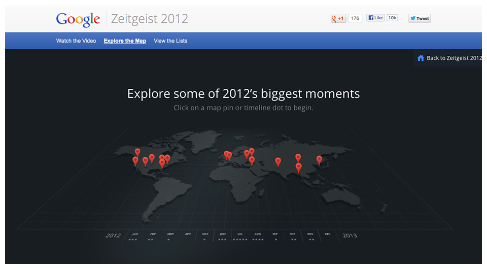
There it is in all its glory; a big and beautiful map with about 16 points of interest. Now go ahead, resize the browser viewport. You will see that down to a certain point it does still look and work kind of okay!
Eventually, you will hit the point where even Google’s developers and designers just caved in and the fluidity of the map just stops. Why? Because there’s no point anymore. The pins are getting so close and the map is getting so small that it doesn’t make sense – users won’t be able to make differentiated taps anymore.
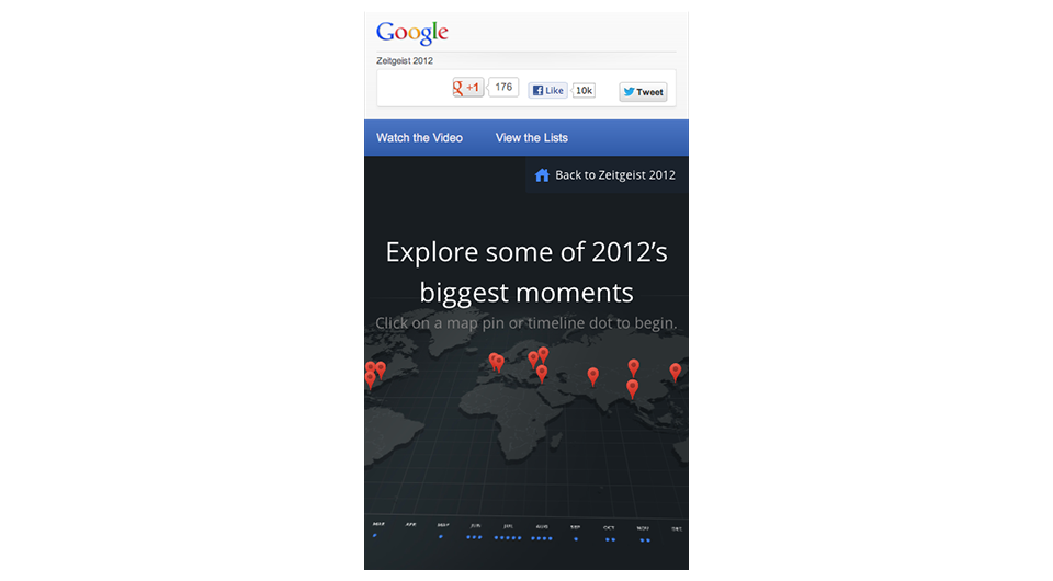
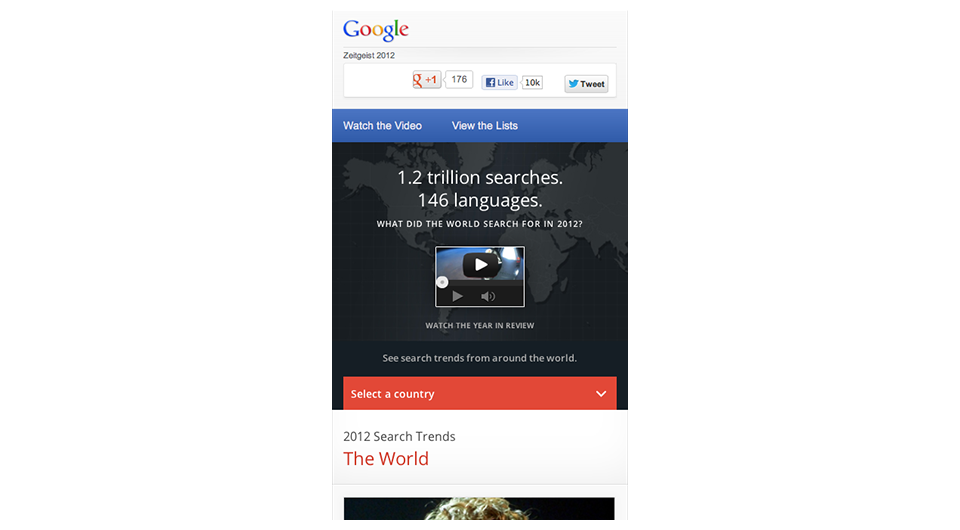
Of course this is something that Google realised. If you refresh the browser at this size, the “Explore Map” option is not even in the navigation anymore!
(Psst, on iPad the pins are actually bigger in size and fewer to accommodate for the device constraints).
So what?
Everything has its time and place. I would personally say that the time and place for certain hot spots implementations on the web at smartphone resolutions is yet to come. The next time I need to defend the gates in future projects, my final trump card after long expositions of interaction design mumbo-jumbo will simply be “Not even Google does it on mobile”.
A camel is a horse designed by a committee.
Sir Alec Issigonis
If you have any kind of feedback or input for improvements, just hit me back with an e-mail or via Twitter.