Wakify
The Process of Visually Actualizing an iPhone App (But Losing the Race)
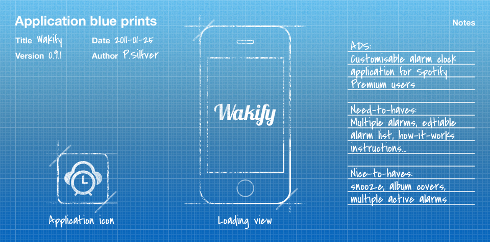
One morning a couple of months ago I woke up tired at the fact that the alarm clock on my iPhone plays the most boring tunes, and then it struck me: What if I could wake up to my favorite songs on Spotify? I did not feel that the idea was unique, but after some benchmarking I could not find one single app in the App Store let you wake up to Spotify songs. So I discussed the idea with one of the developers back at the office (@abeansits), and we realized that we could make it work. We came up with the name Wakify and started producing app maps, sketches, wireframes, interactive prototypes, mockups, animation tests, and finally implementation. Unfortunately — since the project was something we did in our spare time — everything was delayed. On April 9:th (2011), B4print.se released Spot Alarm (for Spotify). On April 11:th (2011), NYC-KIDS released Alarmify. Well #%&?!…
We had a great idea, but we lost the race. Since I had a bunch of design work made for an app that did not reach App Store in time, I thought: Why not share this in a blog post so that people can see and feedback on parts of the design process that I use and advocate? So, here is a selection of some of the visual deliverables that I regularly produce in a mobile app project.
App maps
You have probably stumbled upon the term “site map” before, so deducing the meaning of an app map is not exactly rocket science. Once the desired effects, target group, user journeys, personas, scenarios, functional and non-functional requirements, concept and application definition statement (and so on) has been defined, this is regularly were I start.
App maps visualize and define the relationship and flow between the entities of an application. Once you start sketching this out, you soon realize what kind of navigational model and view types are most fitting for an application.
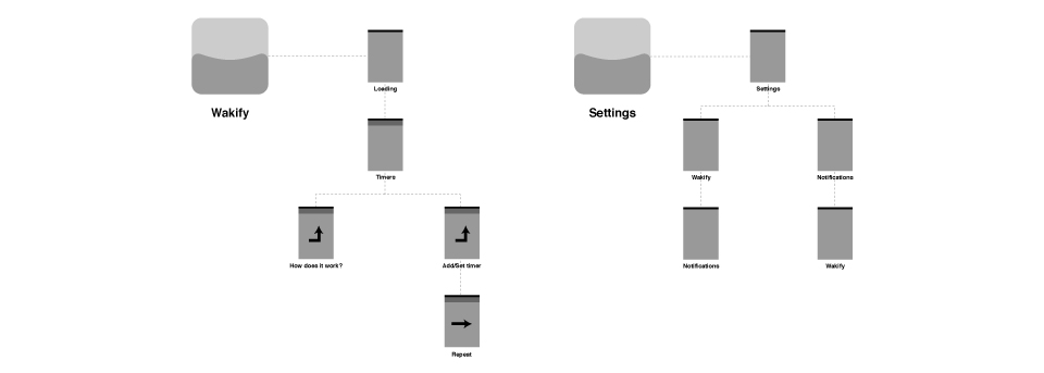
Tools that I use to produce app maps
Pen and paper, whiteboard, post-its, Adobe Illustrator and Omnigraffle Professional.
UI Sketches
With the app map as the ground work I start to sketch out the user interface (UI). It is important not to get hasty and digitize you sketches prematurely. I work with pen and paper for as long as I can to be able to quickly create lots of versions and variations. A positive side effect of using pen and paper is that killing your darlings becomes less of a drag. Document your design rationale, draw arrows and connectors, think about transitions, write bad ideas in red, good ideas in green, take a break, collaborate, have a coffee, read a magazine – simply do everything you need to do to exhaust all possible solutions.
Depending on the quality of the material, this is a great stop for some discussion-based evaluation. I usually show the sketches to potential users, explain, discuss and take notes. You probably wont “find 85% of the usability problems with 5 participants” with sketches at this stage – but you will be able to get feedback on wether you overlooked certain functionality or if the taxonomy is wrong.
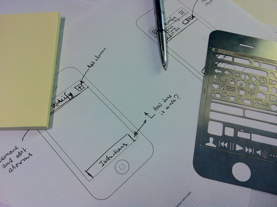
Tools that I use to produce UI sketches
Pen and paper, iPhone sketch pad and iPhone stencil kit from UI Stencils, whiteboard and post-its.
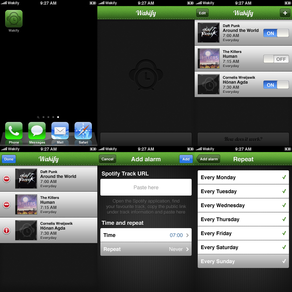
Wireframes and interactive prototypes
Once I have polished my UI sketches as far as possible, I start producing wireframes and interactive prototypes. In my work, the UI sketches are a way to document decisions, solutions and conveying ideas to team members and the end users. However, wireframes (together with the app map) can be much more of an instrument to plan UI real-estate, use for cross-team communication, extended user testing and evaluation, client presentations, complexity break-down, sprint planning and task estimation to name a few.
Creating interactive prototypes can be a pain – but I am going to share a trick that I use to create wireframes and interactive prototypes at the same time using Omnigraffle. In Omnigraffle, any given object can have a dedicated action connected to it (which you will find under the “Properties” inspector). For example, you can dedicate a button to “Jumps Elsewhere” and then pick any given canvas. Once you have set all desired actions, choose “File” → “Export” and set “Format” to “HTML image map”.
I have created an HTML-page with a tiny javascript that creates an iframe that can wrap the “HTML image map”-export from Omnigraffle. When you open it in Mobile Safari, chose “Add to Home screen” and BAM! – you have a full-screen interactive prototype ready for test. Use this link bit.ly/wakifyprototype (or click here) and add it to your home screen to try out one of the interactive prototypes I created for Wakify using this technique. Please note that it is somewhat half-finished, so not everything is tappable, but at least you get the idea.
Obviously, this doesn’t scale that good because of all the different states and possible values that the user can input, but I promise you that if you put this in the hands of a user you will get valuable feedback.
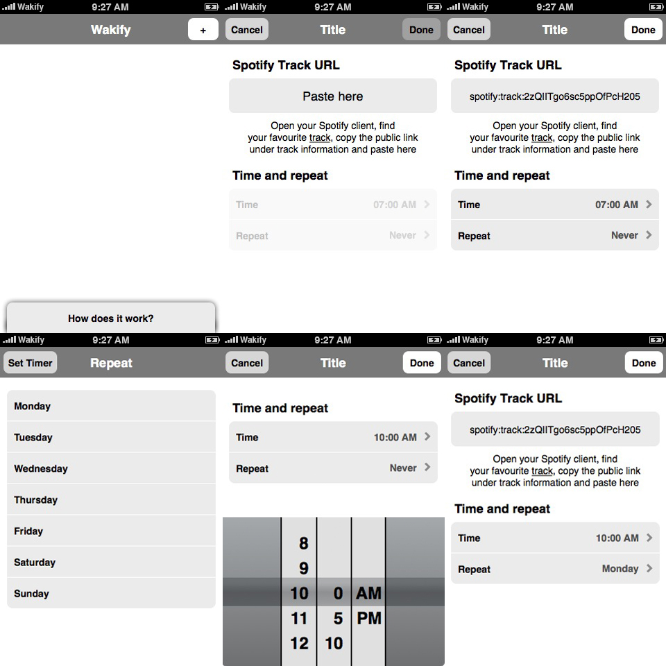
Tools that I use to produce wireframes and interactive prototypes
Omnigraffle Professional, Adobe Illustrator, HTML, CSS and Javascript.
Design flats
Eventually, it is time to splash some color on this bad boy. I prefer (and strongly recommend) working in 320×480 pixels for creating the graphical design for iPhone applications. Why, you say?! Let us list my main reasons:
- Seeing something on a computer screen at 320×480 pixels makes more sense in relation to the physical size of the screen of an iPhone.
- I simply work much slower in 640×960 since I need to put time on making sure I don’t get any half-pixel problems when I scale down (both layer sizes and effects).
- An icon that looks really good in 640×960 might end up looking like a blob in 320×480.
Marc Edwards over at Bjango has written two excellent articles about designing for retina display, so I recommend heading over there if I have not managed to convince you. You will find the articles at Designing for Retina Display and Designing for Retina Display, part two.
Tools that I use to produce design flats
Adobe Photoshop and Adobe Illustrator.
Animation tests
In parallel with the graphical design, I also start outlining animation prototypes to get a feel for how certain transitions will be executed. I am a novice when it comes to the capabilities and limitations of Core Animation, so I regularly make sure to terrorize our developers with a brigade of questions and discussions so that we can reach a solution that both feels great and is actually possible to implement. Although Wakify were not going to contain any unseen or complex animations, I did a prototype in Flash Catalyst just for fun. You can check it out here.
Tools that I use to produce animation tests
Adobe Flash, Adobe Flash Catalyst, Adobe After Effects.
Summary
No, we did not win the race to App Store with Wakify, but we still ended up with a lot of deliverables which I am glad I was able to share with you. The biggest lesson from this project was: do not waste time waiting when you have a fun idea. One thing we could have done differently (except from actually getting off our behinds) was maybe to have released a “Coming soon” page to spread the word before anyone got to us.
If you’re not working on your best idea right now, you’re doing it wrong
David Heinemeier Hansson
37signals
If you have any kind of feedback or input for improvements, just hit me back with an e-mail or via Twitter.