Spotify Cleans House (But Not in the Way You Think)
Power to the user
I’ve been wanting to write this short post for quite some time just to stress how much I love when big companies listen to their users. I wrote a blog post back in April regarding the iPhone tab bar that got some attention. In that post, I used the tab bar of Spotify for iPhone as an example of a small case of picture-word interference – in this case, Spotify illustrated the label “What’s new” with an icon portraying a house. Afterwards, I had a short Twitter discussion on the subject with Tobias Ahlin, UI designer at Spotify, but as time passed I simply forgot about it.
In August, Tobias tweeted me saying:
There’s an update for Spotify iPhone coming out later today that I think you will like… :)
Later that day…
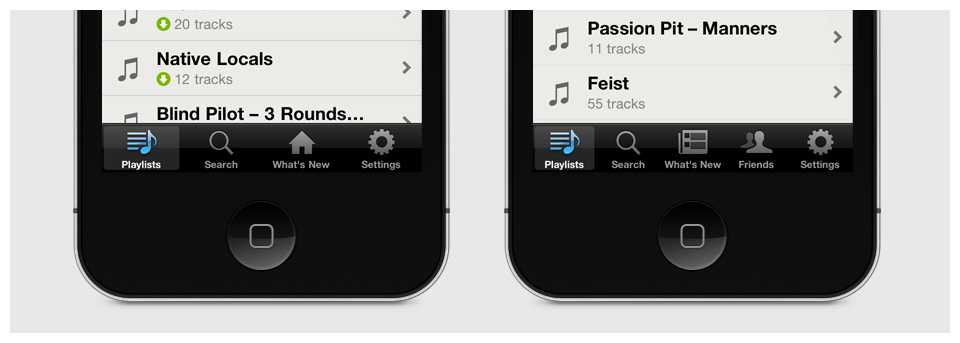
… BAM – there it was! Spotify had actually gone and changed the house icon to one portraying a news paper magazine. Now, I’m not saying that my blog post was the sole reason to why Spotify changed the icon – they are an exceptionally talented and smart bunch and had most likely discussed the issue already – still, just the mere thought that I had some part in that change makes me smile every time I open the Spotify app. For that, I want to thank Tobias Ahlin and the Spotify design team!
If you have any kind of feedback or input for improvements, just hit me back with an e-mail or via Twitter.