Responsive Grid Systems
A Conceptual Framework for Extending Upon the Functionality of 960.gs
With a robust grid system, designers can bring order and structure to a layout by creating a natural flow and rhythm between different elements in the design. A myriad of web based grid systems have surfaced during the last couple of years — such as Blueprint, 960 Grid System, The 1kb CSS Grid, and The Fluid Grid System. Recently, I have found myself re-inventing the wheel over and over again whilst trying to create markup and style for web design with responsive layouts. After some tinkering I came up with a way to more effectively handle this, and what I want to share with you in this post is a conceptual framework to how I currently tackle the implementation of responsive layouts in a kind of “write less, do more” manner.
Constructive design which is capable of analysis and reproduction can influence and enhance the taste of a society and the way it conceives forms and colours
Josef Müller-Brockman
Raster systeme für die visuelle Gestaltung
The role of 960.gs
I regularly use 960 Grid System (960.gs) fluid grid in my design work — which also means that I use the syntax and semantics of the selectors from 960.gs as a springboard when I have to extend on its native functionality.
To both simplify and retain more control of the end result of 960.gs’s fluid grid, I usually remove all the gutter margins from the grid entities since they will render at different widths as they are set with percental values. This means we have to put more effort into letting the contained block-level elements inside the grid entities handle their own margins. The payoff is however big since we can easily change their values without having to re-calculate the widths and margins of all our grid entities.
Four Column Grid System Syntax
Let us start by looking at the syntax and semantics of the selectors from 960.gs that we are going to use. It is important to do this since the selectors we are going to create will use the same expression and terminology. If you are already familiar with how 960.gs works, you can skip to the next section.
For educational reasons, let us look at a grid with four (4) columns.
Note: Remember that we have removed all marginal rules from the grid entities
- .container_4
- The wrapper class for containing a grid module of 4 columns.
- .grid_X
- The class used for defining a grid entity of a certain width. In our grid system, “X” can be replaced with an integer between and including 1-4 — where 1=25%, 2=50%, 3=75% and 4=100%.
- .prefix_Y
- When used in combination with .grid_X, .prefix_Y gives the grid entity a prefixed padding. “Y” can be replaced with an integer value of 1, 2, and 3 — where 1=25%, 2=50% and 3=75%. This notation makes it easy to calculate the resulting width of a prefixed grid entity. .grid_1 (25%) combined with .prefix_3 (75%) gives a sum of 4 (i.e. 100%).
- .suffix_Z
- When used in combination with .grid_X, .suffix_Z gives a grid entity a suffixed padding. “Z” can be replaced with an integer value of 1, 2, and 3 — where 1=25%, 2=50% and 3=75%.
- .push_N
- When used in combination with .grid_X, .push_N pushes a grid entity an arbitrary length. “N” can be replaced with an integer value of 1, 2, and 3 — where 1=25%, 2=50% and 3=75%.
- .pull_Q
- When used in combination with .grid_X, .pull_Q pulls a grid entity an arbitrary length. “Q” can be replaced with an integer value of 1, 2, and 3 — where 1=25%, 2=50% and 3=75%.
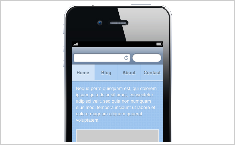
If we were to use this in our markup for a menu, paragraph, and image we could get something like the following.
<header>
    <nav>
        <ul class="container_4 clearfix">
            <li class="grid_1">
                <a href="...">
                    Home
                </a>
            </li>
            <li class="grid_1">
                <a href="...">
                    Blog
                </a>
            </li>
            <li class="grid_1">
                <a href="...">
                    About
                </a>
            </li>
            <li class="grid_1">
                <a href="...">
                    Contact
                </a>
            </li>
        </ul>
    </nav>
</header>
<article class="container_4 clearfix">
    <div class="grid_4">
        <p class="">
            ...
        </p>
    </div>
    <div class="grid_4">
        <figure>
            <img src="..." alt="..." width="100%" />
        </figure>
    </div>
</article>
With some additional styling to our design, the end result could look something like this:
Adding responsiveness
Up until now we have not seen anything new — so lets add some extra sprinkle on top of the pastry. What I would like to do is to combine the power of CSS Media Queries with the 960.gs notation.
Landscape mode
As documented and exemplified in W3C’s current Candidate Recommendations for CSS Media Queries, it is really easy to write CSS selector with rules specifically for a media in (for example) landscape orientation mode.
@media (orientation: landscape) {
    …
}
All CSS written between the curly brackets will only apply to when the orientation mode of the media is landscape (for those browsers whom can actually parse them). Let us then add some landscape mode specific classes to our Media Query.
- .grid_X.landscape_stretch_Y
- Selector defining that a grid entity “X” will in landscape orientation mode stretch “Y”. For example; an element that has both the .grid_1 class and the .landscape_stretch_2 class, will (in landscape mode) stretch to become — yes you guessed it — 75% (1+2=3).
- .grid_Z.landscape_compress_N
- Selector defining that a grid entity “Z” will in landscape orientation mode compress “N”. For example; an element that has both the .grid_4 class and .landscape_compress_2 class, will (in landscape mode) compress to become 50% (4-2=2).
Let us update our previous code example [Code 1] with some landscape orientation mode specific classes:
<header>
    <nav>
        <ul class="container_4 clearfix">
            <li class="grid_1">
                <a href="...">
                    Home
                </a>
            </li>
            <li class="grid_1">
                <a href="...">
                    Blog
                </a>
            </li>
            <li class="grid_1">
                <a href="...">
                    About
                </a>
            </li>
            <li class="grid_1">
                <a href="...">
                    Contact
                </a>
            </li>
        </ul>
    </nav>
</header>
<article class="container_4 clearfix">
    <div class="grid_4 landscape_compress_2">
        <p class="">
            ...
        </p>
    </div>
    <div class="grid_4 landscape_compress_2">
        <figure>
            <img src="..." alt="..." width="100%" />
        </figure>
    </div>
</article>
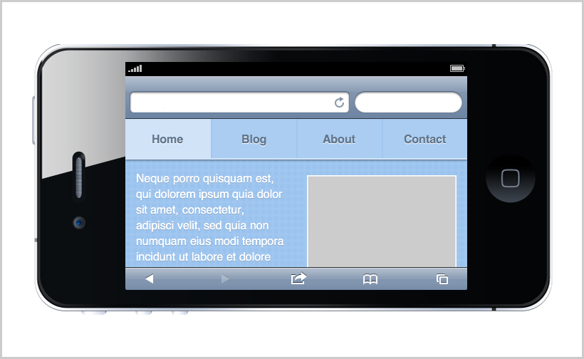
Now, our layout will respond to and change as the orientation of the device changes to landscape. The image will in landscape mode compress from 100% to only occupy 50% of the width, and the paragraph will also compress from 100% to 50%. The result is that the both the paragraph and the image will shrink and position themselves next to each other.
Discussion
Although we only conceptually created a framework for a grid system that responds to landscape mode, we have in fact a good foundation of adding more responsiveness to our grid system. I myself have used this approach for SignificantPixels to add responsiveness to the grid when people visiting the site using an mobile device capable of parsing Media Queries. The system could also be used for graceful degradation — e.g. letting older browsers show one layout whilst new browsers could pick up on the Media Queries and render a layout that wouldn’t be possible on the old ones.
The Flexible Box Layout Model
If you have not yet heard of The Flexible Box Layout Model, get on reading right this moment! It is still a working draft as of 23 July 2009 — however, when the specifications has been nailed down, people starts updating their browsers (and Microsoft starts putting their money where their mouth is) it will be the beginning of the end of floated grid systems for the web. Since this is not yet the case, hopefully this post will help you in some of your everyday work.
Demo
To see a live demo of our responsive four column grid system, please use the following link: http://bit.ly/responsivegridsystem (also found here).
If your using an iPhone or any other media-query capable smart phone browser, try tilting your phone into landscape to see how the grid accommodates to the new orientation.
If you have any kind of feedback or input for improvements, just hit me back with an e-mail or via Twitter.